
London School’s Atlas Update
In 2013, the GLA launched the London Schools Atlas. This was a ground-breaking new resource for parents, planners and policy makers – providing a unique view of patterns of attendance across the capital’s schools together with a wide range of contextual information. Two years on from release, we recently refreshed the data behind the Atlas and thought it an opportune time to give an update on what’s available in the Atlas as well as a little background on the work we do to create it.
In case you’ve not come across it before, the Atlas is an interactive online map that provides a detailed view of London’s state-funded schools, as well as a wide range of contextual information. The Atlas is an open and accessible tool and the data behind the maps is freely available to download from the London Datastore.
Quick overview of information available in the Atlas
School data
A range of basic information for each school is available: location, website address, links to DfE and Ofsted pages, membership of initiatives such as the London Schools’ Gold Club, and past attainment data. However, the real bread and butter of the Atlas is allowing users to understand the patterns of attendance in London’s schools. Select a school and the Atlas highlights the areas where its pupils live; select an area of residence and you can see what schools the local children attend. Similarly, the Atlas contains information about feeder schools, allowing users to view the relationships between primary and secondary schools.
Parents use this data to inform decisions about where to live and what schools to apply to; school place planners use the same data to inform decisions about school expansions and admissions policies.
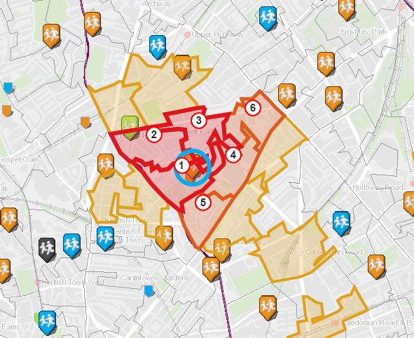
Viewing patterns of pupil residence; primary schools feeding a selected secondary
Thematic layers
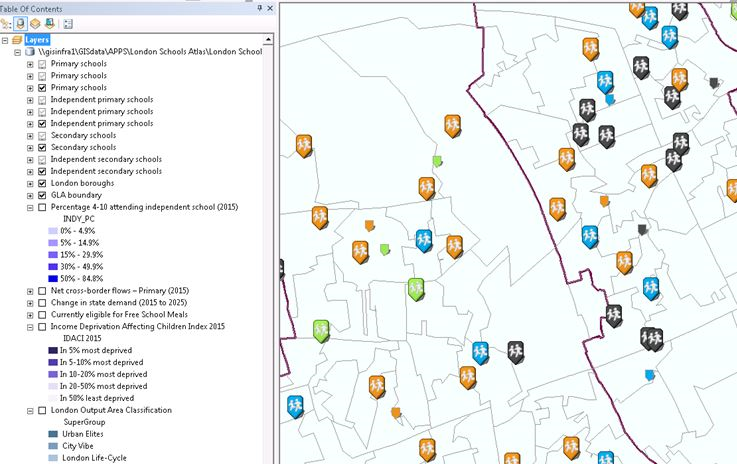
Many of the Atlas’ features, such as thematic map layers, are only accessible in the advanced users mode – accessed through a simple toggle above the map. We made the decision to split out the more complex features of the Atlas to keep the ‘regular’ interface of the map as simple as possible. From the advanced view, users can switch between a selection of thematic map layers displaying relevant information. A number of these layers show contextual information about local areas. Combined with the information about where schools draw their pupils from, these allow users to better understand the make-up of the school’s intake.
Deprivation
Two different deprivation indicators are available: the Income Deprivation Affecting Children Index and eligibility of children for Free School Meals.
Take-up of independent school places
Estimates of the proportion of children in each ward attending independent schools.
Neighbourhood characteristics –
Data from the London Output Area Classification, giving detailed descriptions of the characteristics of London neighbourhoods right down to individual Census Output Area.
Thematic layers showing IDACI deprivation data and the London Output Area Classification.
Demand for places
London’s rapid growth over the last decade has brought with it huge challenges to provide enough school places for the expanding population. The Intelligence Unit recently published strategic pan-London projections of demand for school places to help inform decisions about future provision and funding across the capital. Some key results from this work are presented as thematic map layers in the Atlas.
One layer shows how demand for places is projected to change over the next decade, helping to highlight those areas where additional provision may be required. The second layer shows net cross-border pupils flows by ward, providing a quick overview of which wards in London are net importers or exporters of pupils. Combined with the Atlas’s detailed data on patterns of pupil mobility, this information helps providers identify possible gaps in provision that could be met through new schools or expansions.
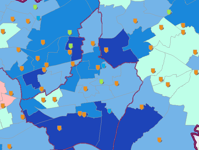
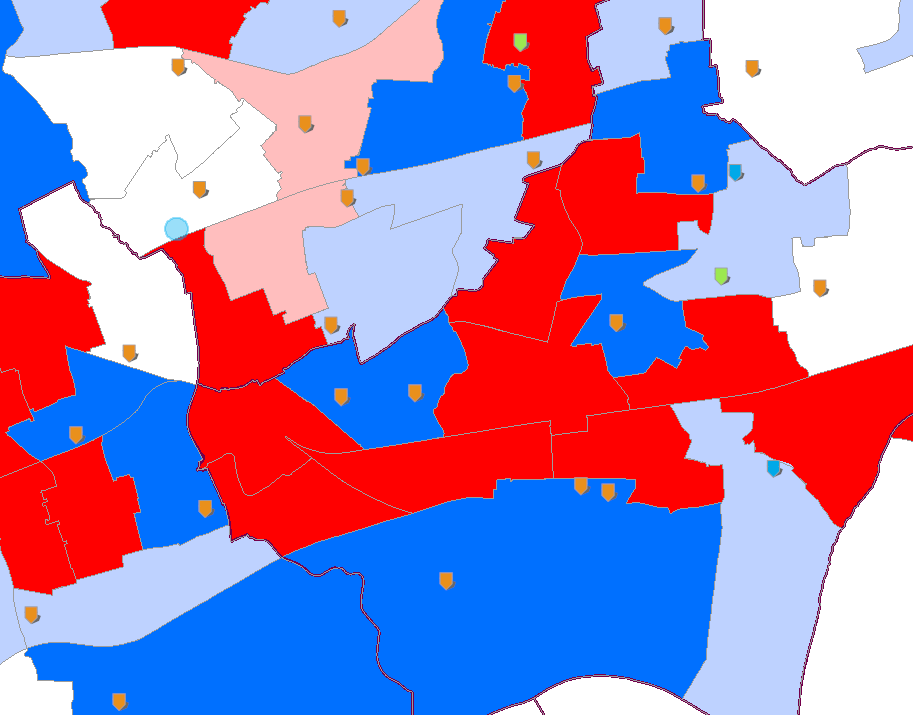
Layers showing projected change in demand for places and net cross-border flows of pupils.
Distance travelled
Another feature accessible in the Atlas’ advanced mode is access to statistics about the distance travelled by pupils to their school. We’ve had this information available for a long time, but recently we decided to improve on it after seeing that stories about shrinking school admissions distances were in the news. Previously we included stats about distance travelled by pupils for the most recent year only, but now we’ve added a time-series of this data going back to 2010 so users can better understand things have changed as pressure on places has increased across the city.
Stats on distance travelled by pupils attending a London primary school.
How we do it
The Atlas was developed entirely in-house using only officer time. We’re pretty proud of how quickly a small team here in the Intelligence Unit was able to take the Atlas from initial concept to working product. The following sections provide an overview of how the Atlas is actually implemented and how we processing the data that underpins it.
The technology
The Atlas has been built using a combination of tools and technologies. These have changed since the application was first launched, and will no doubt change as technologies evolve. The application is currently built in the JavaScript programming language and consumes map data published from an Esri ArcGIS Server hosted on an Amazon cloud-based environment.
Data preparation
The first step was to prepare the datasets to be used by the application. The data behind the Atlas is driven by the annual NPD extracts provided by DfE. The NPD contains anonymised data for almost 8 million pupils and is the source for the catchment, feeder and distance travelled datasets. Due to the data volumes and complexity of the aggregations/calculations, relying solely on Excel was not an option. For this year’s update we decided to overhaul a rather complicated combination of Excel, Access and GIS and move this into one application called FME – something we were already using to process mapping datasets provided by Ordnance Survey.
FME allow us to streamline the data workflow as one single task that can be easily be re-run and edited. Below is the FME ‘workbench’ that calculates the number of pupils that feed each primary/secondary school for the feeder dataset. The original NPD files are input on the left of the image and the data flows through a series of processing steps such as: matching pupils’ between primary secondary schools; removing schools outside the study area; and removing disclosive flows between schools. Finally, the workbench writes out the data in a format ready for the application and for publication on the London Datastore.
Screen shot of one of the FME workbenches that process the NPD data ready for the Atlas.
The benefit of this approach is that the method is self-documenting, parameters can be easily changed and the same process can be run on an updated NPD dataset a year later and consistent output produced.
Spatial data preparation
The geographic data, such as school locations and thematic layers, are maintained in the GIS application (Esri ArcMap) and made available to the application through ArcGIS Server. Practically this means we created a database of all the layers we wished to present in the application (e.g. school locations, demographic data, base maps…etc) and published these as a map service for the application to consume.
Spatial data prepared in Esri ArcMap.
The Edubase register of all educational establishments was a key input here, as this contains the Unique school Reference Number (URN) and allows us to link these attributes to the NPD. The DfE also publish a list of link files that provides information on school closures, merges, renaming and any status changes – these are used to feed data on the superseding and preceding schools in the Atlas.
Data visualisation
A majority of the data presentation and styling is delivered by the Esri map service and controlled using the ArcGIS API for Javascript. This controls elements such as the searching results, school locations and display of images. The Atlas also uses a travel time API (provided by iGeolise) to overlay travel time contours on the map and the Google Chart API to generate the school attainment charts. Bespoke code was written to control how these elements interact and are presented to the user.
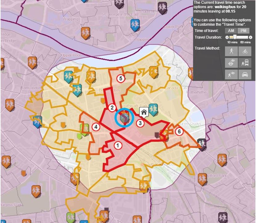
Travel time API showing the distance that can be travelled in 20mins by walking/bus from a school.
Google Chart API used to displaying school attainment data for a school.
What’s next?
We’ll be giving the Atlas a major overhaul in the New Year – completely redesigning the interface to make it more intuitive to use as well as adding lots of new functionality. We’re always keen to find out how people have been using the Atlas and hearing your suggestions for improvements we can make. If you have feedback for us, please get in contact.