Indices of Deprivation 2025: an exploratory analysis
Introduction
The Indices of Deprivation 2025 (IoD25) provides a suite of measures on relative levels of deprivation across 33,755 neighbourhoods, called Lower-Layer Super Output Areas (LSOAs), in England.[1] This latest release updates and replaces the Indices of Deprivation 2019 (IoD19). This note provides a short summary of the main findings and trends in the data, focusing exclusively on London.[2]
Index of Multiple Deprivation
The primary measure within the IoD25 is the Index of Multiple Deprivation 2025 (IMD25), which is the Government’s official measure of deprivation in England. The IMD25 is based on the weighted combination of seven standalone indexes, collectively referred to as the domains of deprivation. These seven domains, with weightings shown in parentheses, are: Income (22.5%), Employment (22.5%), Education (13.5%), Health (13.5%), Crime (9.3%), Barriers to Housing & Services (9.3%) and Living Environment (9.3%).
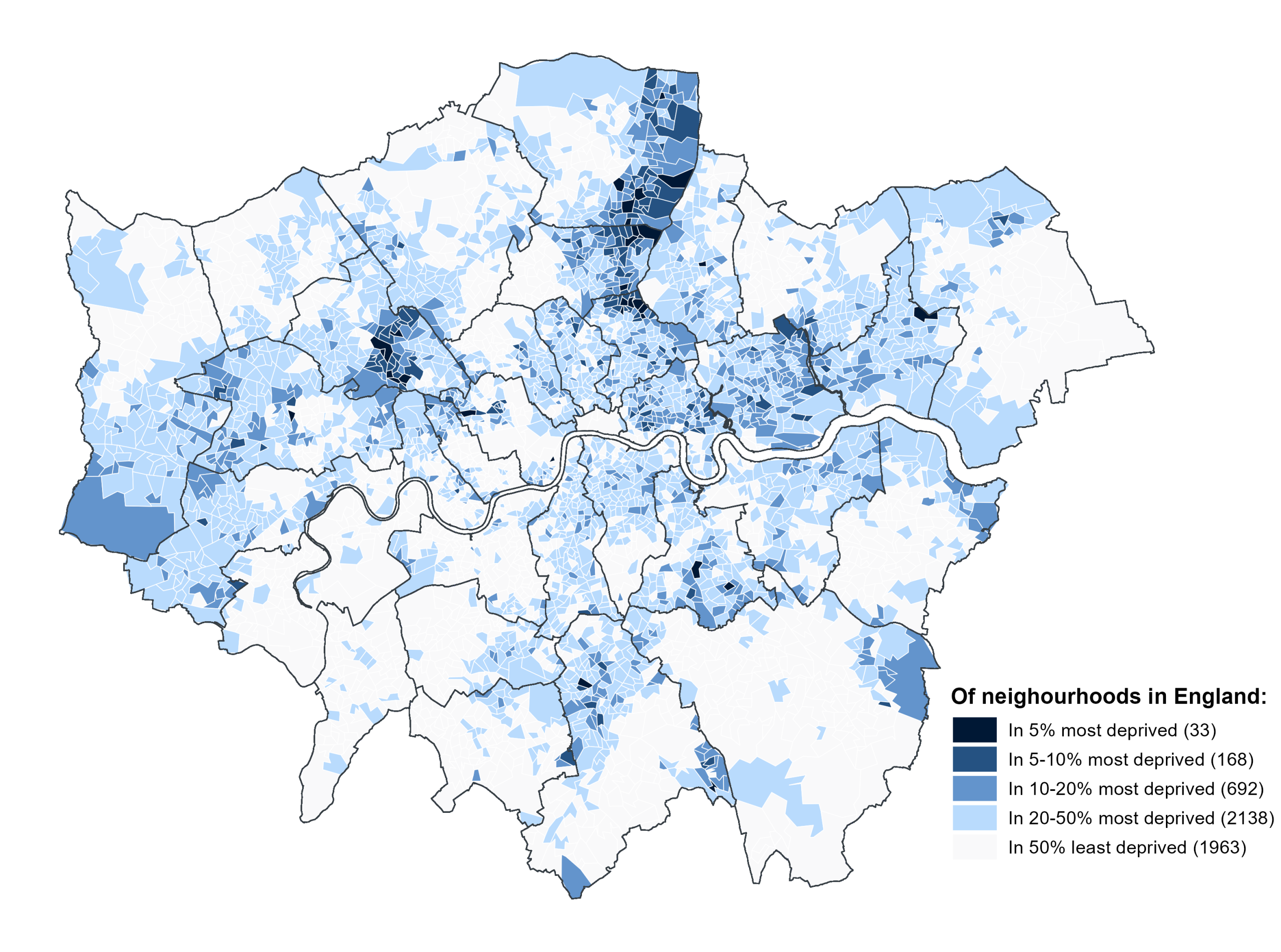
Using the headline IMD25 measure, Figure 1 plots London’s neighbourhoods by different levels of multiple deprivation. Of the 4,994 neighbourhoods in London, 33 (0.7%) are among the most deprived 5% of neighbourhoods in England. A further 168 (3.4%) are among England’s most deprived 10%. Thus, in terms of the most severe levels of multiple deprivation, neighbourhoods in London are underrepresented relative to the national distribution.
The geographical spread of multiple deprivation within London exhibits a familiar, crescent-shaped pattern, beginning from the eastern side of Enfield down through Haringey and Hackney and across into Tower Hamlets, Newham and Barking and Dagenham. There are additional hotspots of higher levels of multiple deprivation in West London, notably in Brent, Ealing and Hounslow, as well as in Lewisham and Greenwich in South London. Taking a broader view, the data also shows a clear divide between Inner London – where boroughs tend to have a higher but more evenly-spread distribution of deprived neighbourhoods – and Outer London – where boroughs tend to have a lower but more locally concentrated distribution of deprived neighbourhoods.
Figure 1: Multiple deprivation (IMD25) in London by neighbourhood, grouped by different levels of severity
Domains of Deprivation
Figure 2, which plots London’s neighbourhoods by different levels of deprivation for each of the seven domains of deprivation, provides a more granular picture of the nature of deprivation in London.
Income and Employment
One of the most striking findings that emerges from this more detailed analysis centres on comparison of the two primary domains, which collectively make up 45% of the IMD. On the one hand, London exhibits relatively high levels of Income deprivation, following a geographical distribution that closely mirrors that of multiple deprivation as described above. Relative to multiple deprivation, however, the experience of Income deprivation in London is markedly more intense in most areas, particularly in Tower Hamlets, where 60% of neighbourhoods in this borough are among the 20% most deprived nationally. On the other hand, London exhibits relatively low levels of Employment deprivation, outside of one clear hotspot on the Eastern side of Enfield. The principal driver of these divergent trends is not, as it might appear, the phenomenon of under-employment, but instead the far more pervasive issue of housing costs, which are far higher on average in London than in the rest of the country. Specifically, this measure of income deprivation directly captures the disproportionate impact of higher housing costs in London through the use of an after housing costs measure of income.[3]
Figure 2: The seven domains of deprivation in London by neighbourhood, grouped by different levels of severity
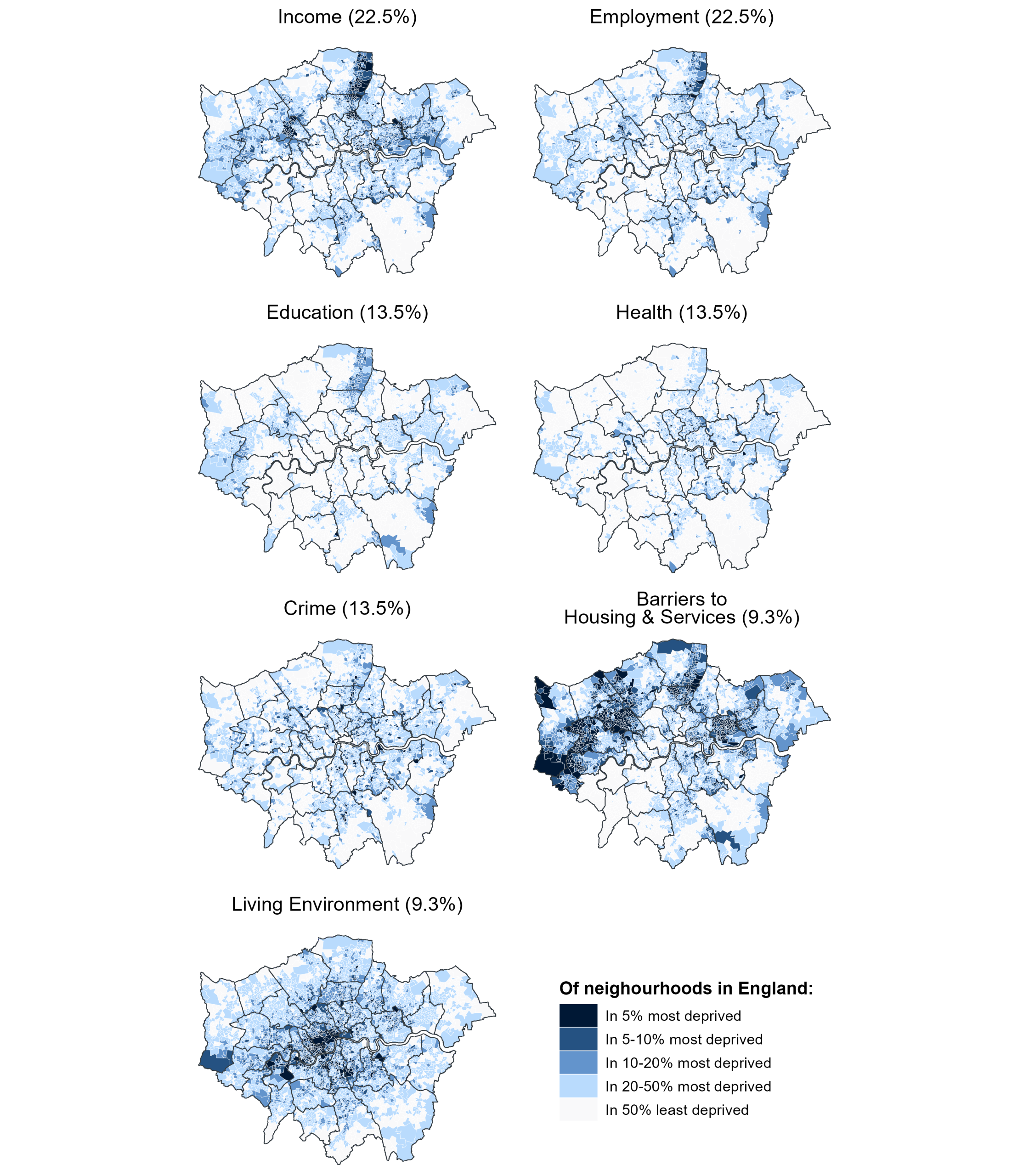
From this perspective, there are clear parallels between the disparity in Income and Employment deprivation in London and the large differences observed between before-and-after housing costs measures of relative poverty.[4]
Education
The level of Education deprivation in London is, relative to the national distribution, particularly low, though there are two notable hotspots. The first centres on that familiar crescent-shaped group of boroughs in the northeast but notably excludes the more central boroughs of Hackney and Tower Hamlets. The omission of these more central boroughs within this group is reflective of the distinctive geographic contours of Education deprivation, with there being more Outer London than Inner London neighbourhoods among the most deprived 10% of neighbourhoods in England. This is a phenomenon that is only observed for the domains of Education and Barriers to Housing & Services.
Health
Like Education, the level of Health deprivation in London is also relatively low. However, in closer alignment with the other domains and the IMD overall, higher levels of Health deprivation are quite heavily concentrated within Inner London, particularly the boroughs of Hackney and Tower Hamlets.
Crime
The level of Crime deprivation in London is slightly higher than that of Education and Health, though it still compares favourably to the national distribution. Spatially, the distribution of crime deprivation is the most uniform of the seven domains. Apparent hotspots are observed within almost every borough, although the intensity of Crime deprivation tends to be higher within Inner London.
Barriers to Housing & Services
With regard to Barriers to Housing & Services, the data draws immediate attention to two major hotspots of highly concentrated and severe deprivation. The first, and most acute, centres on the West London boroughs of Hillingdon, Hounslow, Ealing and Brent. 351 (50%) of the 700 neighbourhoods that make up these four boroughs are among the 10% most deprived nationally, and 230 (33%) are among the 5% most deprived nationally. A second hotspot is, again, seen in the crescent-shaped group of boroughs between Enfield and Barking and Dagenham.
Living Environment
Turning now to the last of the seven domains, deprivation of the Living Environment in London is experienced by almost all Londoners. Although there are clusters of neighbourhoods in the furthest Outer London boroughs that are among the 50% least deprived nationally, the vast majority of neighbourhoods in London are among the 50% most deprived, with a large number of Inner London neighbourhoods falling within the county’s most deprived 1-10%. London’s role as the metropolitan capital means that levels of pollution, air quality and road traffic are inevitably higher than in many parts of the country. The indicators concerning the outdoor environment nevertheless comprise just one half of this domain, while the other half concerns the indoor environment, which is defined in terms of the quality and energy efficiency of housing, as well the provision of domestic green space. With regard to these indicators, London does not have any sort of inherent, or clearly defensible, disadvantage.[5]
Change from IMD19
This initial exploration of IoD25 would be incomplete if it did not consider how IMD25 compares with the previous IMD19 release. But before such comparisons can be made, it is crucial to understand that the IMD, along with all domain and supplementary indexes, is not designed for use in time series analysis. Rather, its purpose is ‘to measure as accurately as possible the relative distribution of deprivation at a small area level at a snapshot in time’.[6] Ultimately, this means that temporal comparison of the IMD cannot be used to say that an area has become more or less deprived. The subsequent analysis of temporal differences between IMD19 and IMD25 should, therefore, be treated with caution and regarded as exploratory in nature, with careful consideration of the caveats outlined here and in more detail in the footnotes below.[7]
Figure 3 plots change between IMD19 and IMD25, grouping neighbourhoods by both the direction and extent of this change. Overall, 2,136 (44%) out of the 4,835[8] (see footnote) neighbourhoods in London fall within the middle group, meaning that the level of relative deprivation in these neighbourhoods has changed by plus or minus 5% – that is, minimally. The remaining 2,730 neighbourhoods (56%) fall in almost equal number on either side of this 5-point threshold; 1,272 neighbourhoods (26%) show an increase in relative deprivation of more than 5 percentage points, while 1,458 neighbourhoods (30%) show a decrease in relative deprivation of more than 5 percentage points. The breakdown of these two broad groups respectively into three subgroups based on different thresholds of change is also broadly uniform, with just over 40% of the neighbourhoods in these two respective groups falling above the 10-point threshold and 7% falling above the 5-point threshold. The upshot is that net change in relative deprivation in London stands close to zero.
Figure 3: Percentage point difference in IMD rank between IMD19 and IMD25 in London by neighbourhood, grouped in terms of the direction and extent of this differential
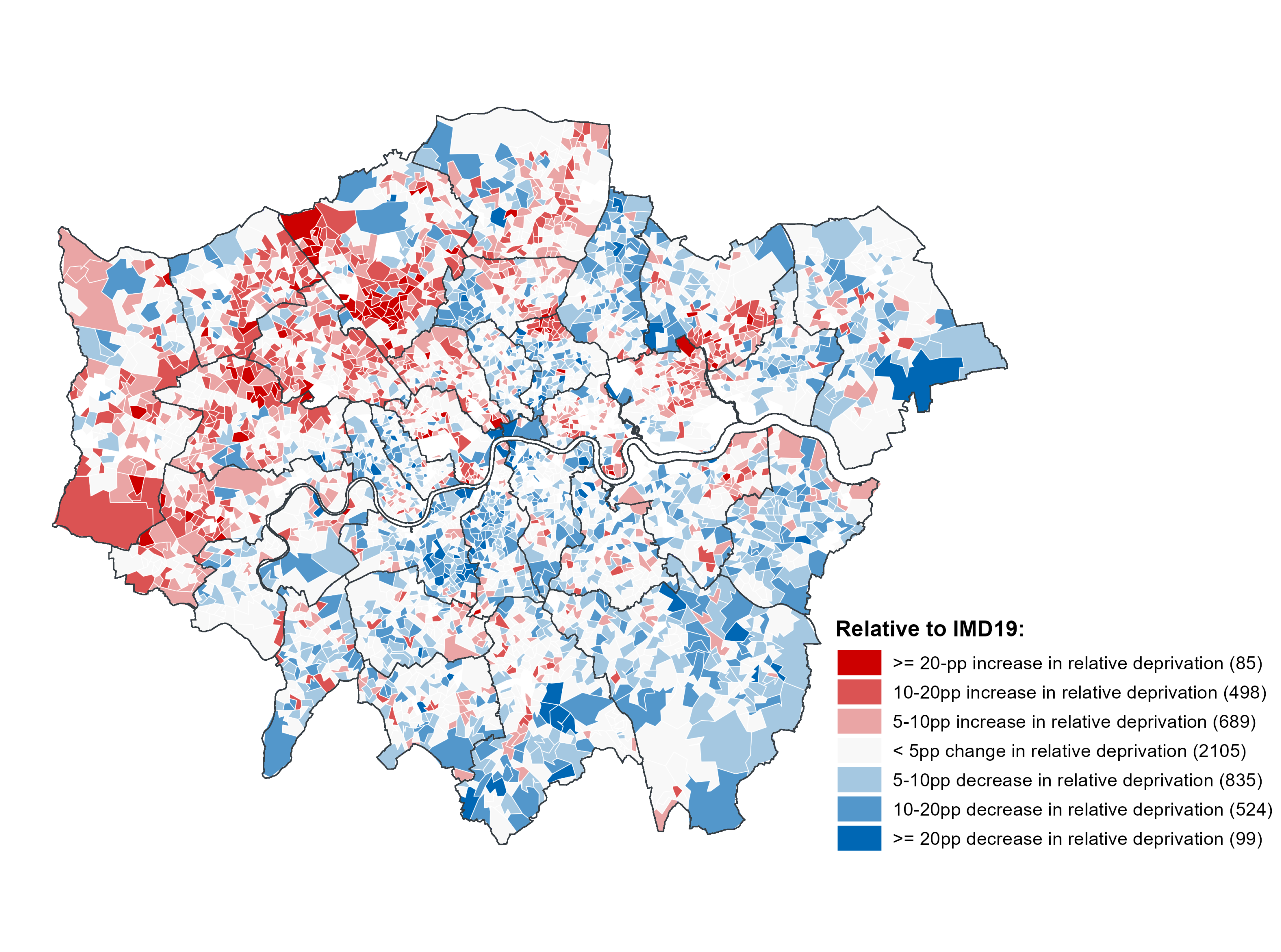
Yet despite the fact that the level of relative deprivation in London has changed very little in the aggregate, Figure 3 reveals that the direction of change is heavily dependent on geography. A large majority of the neighbourhoods that have seen an increase in relative deprivation of 10 points or more are located in boroughs in the north and northwest of London. Conversely, a smaller but still substantial proportion of the neighbourhoods that have seen a decrease in relative deprivation of 10 points or more are located south of the river. More detailed analysis of the temporal differences between each of the seven domains of deprivation is required to provide any meaningful insight as to why this group of boroughs in the north perform so poorly relative to IMD19. Potential explanations – including exploring the possibility that the IMD’s transition to an after housing costs measure of income has had a disproportionately negative impact on neighbourhoods in these boroughs – will be considered in future GLA analysis, which will be published in the coming weeks. This subsequent analysis will also include an exploration of the supplementary indexes released alongside IMD25, as well as detailed analysis of the various sub-domains that make up each of the seven domains of deprivation.
[1] See the English Indices of Deprivation 2025 for more detail on these statistics and to download the data used in this analysis.
[2] It is important to recognise that the scope of this work is limited to descriptive analysis of the data. While this does allow for exploration of general trends, it does not permit anything close to causal explanation with respect to the real-world factors driving these trends at a neighbourhood or borough level.
[3] As Richard Brown explains in a particularly insightful London-focused analysis of IMD25, previous versions of the IMD used the alternate before housing costs measure of income. As a result, a large increase in Income deprivation is observed in London when comparing to IMD19. Future GLA analysis, due to be released over the coming weeks, will explore temporal differences between the domains in deprivation in more detail.
[4] For more detailed analysis of poverty in London, see the Population in Poverty indicator that is part of a broader suite of GLA indicators around Economic Fairness in London. Also look out for a forthcoming GLA Intelligence report which analyses trends in poverty and income using the latest 2025 release of the Households Below Average Income (HBAI) survey.
[5] Future GLA analysis of IoD25 will dig deeper into London’s performance on the various domains that comprise each of the seven domains of deprivation.
[6] See the IoD25 research report.
[7] The first key design aspect of the IMD that limits backwards compatibility is the fact that the IMD is a relative measure of deprivation. This means that deprivation is not defined in absolute terms, but instead in relation to the differences between neighbourhoods. Accordingly, change in the IMD score of a given neighbourhood may reflect actual change in the experience of deprivation in that neighbourhood. But it may alternatively reflect actual change in the experience of deprivation in other neighbourhoods. Naturally, the more realistic scenario is that change is driven by some variable combination of both of these dynamics.
The second design aspect to highlight is that measurement of the IMD is subject to change from one release to the next. This is a purposeful design decision that ensures that the IMD is adaptive and relevant to changing policy contexts and methodological standards. It does, however, further complicate interpretation of temporal change. IMD25 includes 16 new indicators, while 14 of the 39 indicators used in IMD19 have been subject to ‘significant modification’. Thus, change in IMD score might not reflect any form of actual change in the experience of deprivation, but instead reflect the impacts of one or more changes to measurement. While it is not possible to distinguish between the conflicting dynamics described in the paragraph above, it is at least possible to detect these methodological impacts through a thorough and careful reading of the data.
[8] An additional complication of conducting temporal analysis of the IMD is that the LSOA (neighbourhood) codes and boundaries used for IMD19 were subject to revision in 2021, meaning that IMD25 does not match directly with IMD19. Several hundred LSOAs in London were assigned new codes in 2021, but the more substantive consideration is that this new classification saw the creation of 22 new LSOAs within London, effectively splitting around 40 LSOAs into 2 separate LSOAs. In practical terms, this means that temporal comparisons between IMD19 and IMD25 must rely on the older 2011 LSOA classification. For this analysis, 2011 LSOA codes were brought into IMD25 using the ONS LSOA lookup file. The mean IMD rank was then calculated for each respective pairing of LSOAs that were collectively defined as a singular LSOA in IMD19.