
Population Projections Explorer
Understanding London’s population, and how and where it can be expected to change, is central to so much of the work undertaken at the GLA, in the boroughs and by many others across the capital.
Each year the GLA Demography team produces an updated set of population projections which provide a huge amount of data for those interested in London’s changing population.
Our projections include information on the age and sex structure of the population, are available at borough, ward and MSOA level, and project out to 2050. In addition to data on the number of residents, they include detailed information on births, deaths and migration flows.
As a result, the projections constitute one of the largest primary datasets the GLA publishes with each release comprising up to 100 million data points in a range of files and formats.
With so much data available, one of our biggest challenges has always been making the data accessible and useful to those who are interested in knowing more. I’ve worked with these dataset sets for over a decade in a number of jobs across different organisations and I’ve always felt like there was something more that could be done to make the numbers more accessible.
I’ve been involved in a couple of different attempts to develop products which would do just that but the results have always felt a little anti-climactic. What I wanted was an all-singing, all-dancing interactive tool with maps and charts, the ability to cut up the data, to dig into it, and to better understand it. I was beginning to think that maybe what I envisaged was a little too ambitious. And then I mentioned my dream tool to Mike Brondbjerg a Data Visualisation Developer here in the CIU and asked him what he thought. “Yeah”, he said, “we can definitely do that”.
So here we are a few months down the line announcing the London Population Projections Explorer, a brand-new tool that finally does justice to the data.
The explorer is going to be useful for you if want detailed population data, if you need to understand trends within particular groups, or quickly get hold of some high-level figures. But it’ll also be great if you don’t have a real purpose – if you just want to play around with the numbers and get a better understanding of how, why and where London’s population is expected to change.
I’m really pleased that we finally managed to get this project off the ground and that the end result is so impressive. For years this was my bug bear so it’s nice to finally feel like we’ve finally got the tool I always wanted. I’m going to have to find something else to complain about now.
Below, Mike explains how the tool works and some of the technical challenges faced in developing an interactive web application that can handle 700Mb of data.
About the Population Projections Explorer
The Population Projections Explorer is a web application, developed by the GLA City Intelligence Unit, to help primarily local government professionals across London, but really anyone with an interest, explore, visualise and extract the projections data they need, quickly and easily.
Using the Explorer
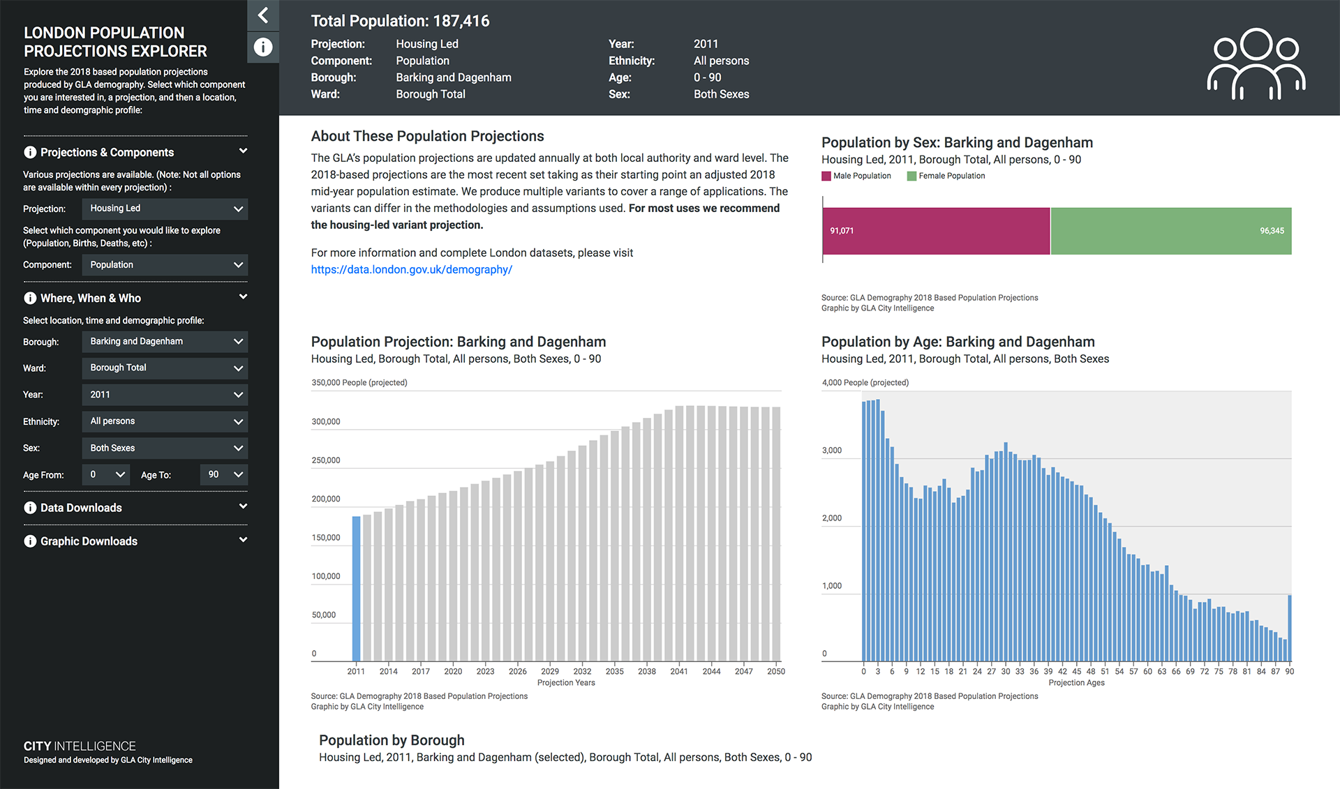
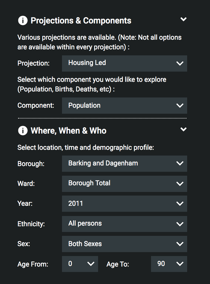
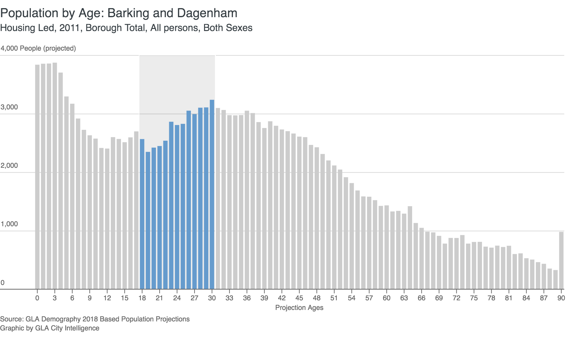
Having chosen the most appropriate projection (see advice in the app, but Housing Led is usually best), a number of components are available to you: Population, Births, Deaths, and Domestic In & Out and International In & Out migration.
Next, choose the geographic area of London you are interested in. Projections are given at Borough Level, and for Housing Led projections, at Ward Level too.
You will now see the projection results for All Persons, for each year between 2011 to 2050, and split by age and sex for your currently selected year.
By interacting with the visualisations themselves, or the menu on the left, you can further filter the results, by selecting a particular sex, age range and any year between 2011 and 2050.
Geographic Context
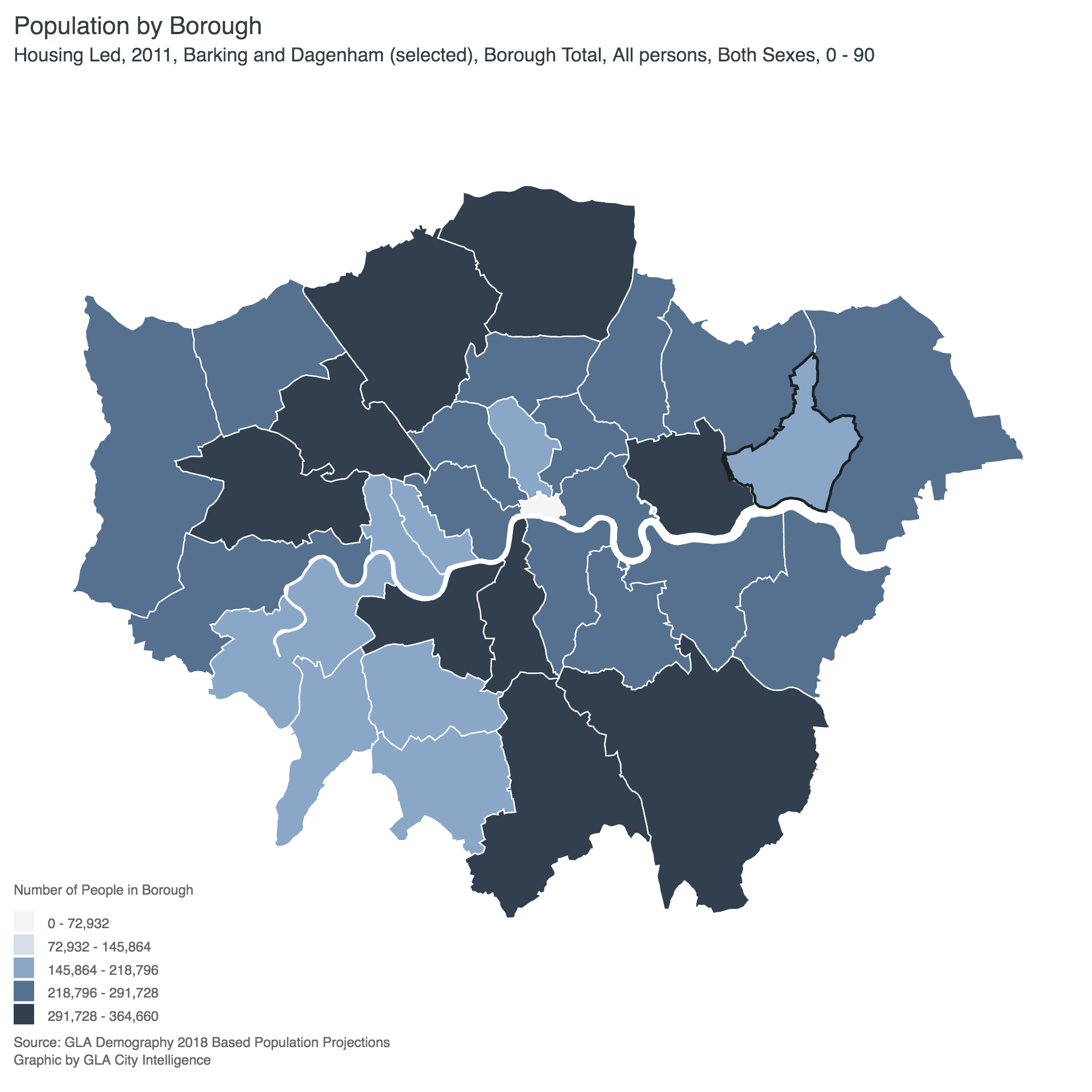
If you are exploring at Borough Level, the London (Choropleth) Map shows not only your Borough’s data, but all other Borough Totals for the same demographic selection.
Selecting a Ward within your borough will switch the map to show ward level totals for easy comparison.
Data Downloads
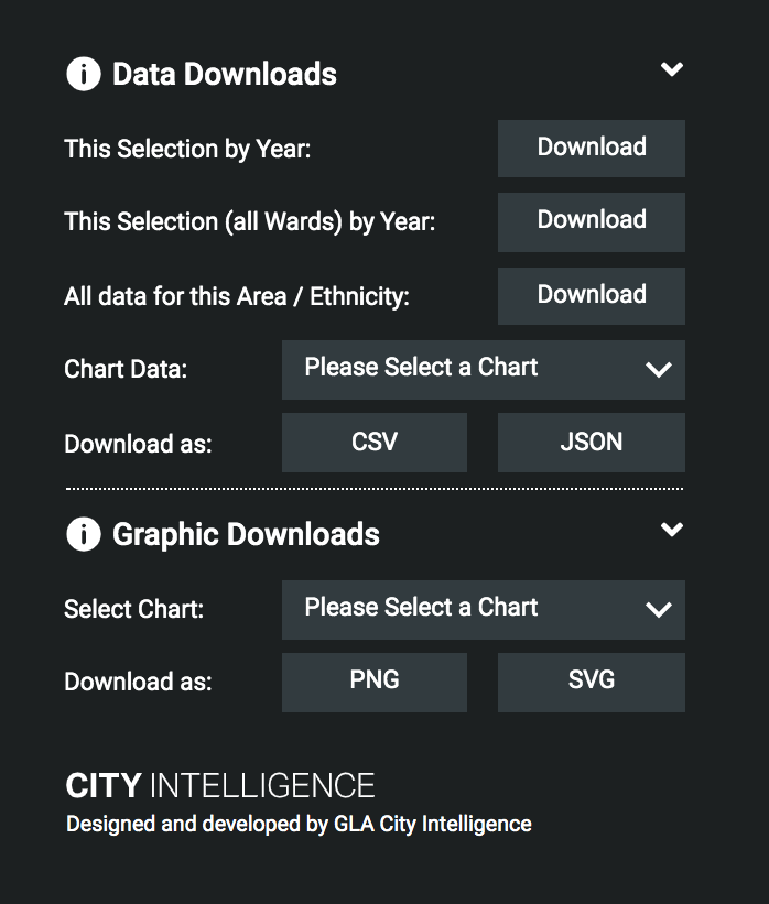
Opening the “Data Downloads” panel in the menu, allows you to select the data you need.
You can download the component counts, for your selected borough/ward, or all wards in your borough.
Additionally, you can download the specific data currently visualised in the charts and maps, in both CSV and JSON format.
Graphic Downloads
Should you need the visualisation of the current data for a presentation or publication, then you can extract any of the charts in either PNG or SVG format.
If you are re-using a graphic from the tool, please include the original Source & Credit, and ideally link back to: https://maps.london.gov.uk/population-projections/ or https://data.london.gov.uk/demography/
Technical Development
Handling the Data
The entire output data from the projection model, totals over 6 million rows, 40 columns and weighs in at around 700MB. The sheer size of the data is one of the main reasons we wanted to provide an interface to users, so they could get to their data without having to download the entire dataset first.
The data is stored in a Postgres database with an API, against which we can query for a subset of data based on a selected Projection, Component, Borough & Ward.
Having returned the subset of data to the web application (around 7000 rows), we could then quickly filter (by sex, age & year) and cross tabulate the totals in the frontend using Crossfilter.js.
Balancing the speed and frequency of requests to the database, and the responsiveness of the frontend filtering was key to (we hope) a good user experience.
Application Framework
We used Vue.js as our application framework. It was vital to help us keep track of data requests, and maintain the current state of the application (e.g. selected Projection, Component, Borough, Ward, Ethnic Group, Year, Sex, Age, etc).
Vue was also great at dynamically computing the options that should be shown within each menu based on your previous filter selections and keeping the frontend in step with the current data in the application.
Data Visualisation
The data visualisation elements within the application were developed as independent and reusable javascript libraries, built from the ground up using D3.
The design of the components was based on the principles we’d developed earlier in the year within our own City Intelligence Data Design Guidelines.
The longer-term plan with these “London Centric” visualisation components is to make them re-usable within all of our own visualisation projects, keeping our own work visually consistent and quick to develop. As they evolve into a useful and well tested set, we will open source them, allowing other developers to make use of them particularly within London Local Government.
Start Exploring
Click the link below to start exploring the London Population Projections, and do let us know if you have any feedback, or thoughts on how we can improve the tool: demography@london.gov.uk