
Is London’s cost of living pulling away from the UK average?
Londoners have long suspected that life in the capital costs more, but the gap depends very much on what is being bought.
As explored below, two pints of milk cost about the same in London as the UK average. A pint in the pub, by contrast, costs around a quarter more. Childcare costs more still. This contrast reveals something important about how inflation works in a high-productivity city like the capital: goods sold through large national chains often differ little in price across the country – but services shaped by local wages, rents and operating costs increasingly reflect the economics of London itself.
Economists have long observed this pattern internationally: richer, more productive economies tend to experience faster inflation in local services because wages rise faster than productivity in sectors such as hospitality, childcare and personal services. London increasingly appears to be experiencing this dynamic.[1] To explore this divergence, we construct a shelf-front inflation measure in two ways: for the UK as a whole and for London.[2] The data captures the prices that official collectors gather in person from shops around the country, covering roughly half of the inflation basket: food, household items, clothing, eating out and services such as childcare. It leaves out centrally priced items, above all rent and domestic energy, giving a cleaner read on the everyday cost of living before housing.
Comparing the two reveals a clear pattern. Prices in London have not always grown faster than the rest of the country. For years, the capital broadly tracked the UK average. The divergence only began to emerge around the mid-2010s, widening steadily through the late 2010s and sharper still during the 2022–23 cost-of-living shock.
Has London’s price growth always been faster than the UK’s?
Not on this evidence. Since 2008, price growth in London and the UK moved almost in lockstep for years (see Figure A1). The lines only begin to part meaningfully around 2015. Since then, London’s shelf-front prices have consistently risen faster than the UK average.
By early 2026, shelf-front prices have risen by around 70% in London since 2008, against roughly 61% across the UK. London’s cumulative shelf-front growth now exceeds the official headline CPI’s, while the UK’s falls below it. This ordering reflects two things. Headline CPI is itself a mixed basket: roughly half is the in-shop prices we track here (food, household goods, eating out, childcare), and half is items priced centrally rather than on a shelf, above all rent and domestic energy. Nationally, those centrally priced items rose faster than shop-shelf prices over this period, which lifts headline CPI (+64%) above UK shelf-front (+61%). London’s shop prices, however, climbed faster still: at +70%, they have outpaced even that lifted headline figure.
Figure A1. Cumulative shelf-front prices since 2008
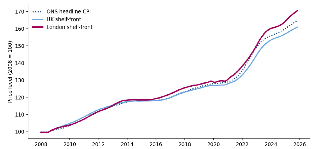
Note: London, the UK and the official CPI; 2008 = 100; 12-month moving average. Latest data point: November 2025.
Source: Long-Run Price Database (R. Davies); ONS Consumer Price Inflation. GLA Economics calculations.
Different inflation gaps opened at different times
Over time, multiple economic shocks have opened different kinds of inflation gaps that led to a divergence between London and UK trends.
Figure A2 separates these effects into two panels. Panel A compares London shelf-front inflation with the official headline CPI. This gap helps show how London’s locally collected prices behaved relative to national inflation during major economic events. Panel B compares London shelf-front inflation with UK shelf-front inflation, showing the persistent gap between the capital and the country that survives those swings.
For much of the late 2010s, London’s shelf-front inflation ran slightly above CPI, reflecting steadily rising local service costs in the capital. The gap widened after the 2016 Brexit referendum, when sterling depreciation pushed up import prices nationally – while London’s already high-cost service economy continued to face upward pressure from wages and rents.
The divergence briefly narrowed during the 2020 lockdowns, when London’s hospitality, travel and other consumer-facing services stalled. As the economy reopened in 2021, London shelf-front inflation accelerated sharply. Labour shortages, strong pent-up demand and rising operating costs hit the capital’s service economy particularly hard, reopening the gap against CPI and UK average shelf-front inflation.
The relationship shifted again during the 2022 energy crisis. Headline CPI surged as domestic gas and electricity prices spiked nationally, pushing the national measure above London shelf-front inflation. This reversal proved temporary. As energy effects faded from the annual comparison, London shelf-front inflation once again moved back above CPI, increasingly driven by locally priced services rather than imported energy costs.
Panel B shows that, despite these swings, the London-versus-UK shelf-front gap has remained persistently positive through most of the period and is now close to its widest level in the observed data. Small annual differences, repeated through successive economic shocks, have accumulated into a lasting premium.
Unlike the temporary swings seen against CPI, the London-versus-UK gap did not fully reverse after the major shocks passed. By the mid-2020s, London shelf-front prices were consistently running ahead of the national average.
The two panels together point to a broader structural shift. National inflation is heavily influenced by energy prices, imported goods and nationwide shocks. London shelf-front inflation increasingly reflects the dynamics of a high-cost urban service economy, where local wages, rents and operating costs feed more directly into prices.
Figure A2. Two gaps: London versus headline CPI, and London versus the UK
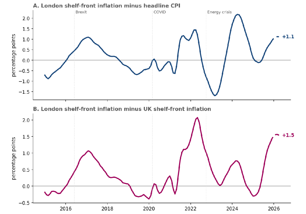
Note: 12-month moving average of percentage-point gaps. Panel A: London shelf-front inflation minus headline CPI. Panel B: London shelf-front inflation minus UK shelf-front inflation. Positive values indicate London running above the comparison measure. The UK measure includes London itself, meaning the underlying London-versus-rest-of-UK divergence is likely slightly larger than shown.
Source: Long-Run Price Database (R. Davies); ONS Consumer Price Inflation. GLA Economics calculations.
The ups and downs, and a lag behind CPI
Figure A3 shows the rhythm of inflation itself: the long climb to the 2022–23 peak above 10%, and the descent since to around 3%.
Observed shelf-front data run only to November 2025, so the most recent months are nowcast[3] for both London and the UK. One feature is worth flagging. Shelf-front inflation broadly follows the headline CPI but tends to turn a little later, especially around large shocks.
Headline CPI peaked in late 2022. Shelf-front inflation did not peak until the spring of 2023, about four months later for the UK and six months later for London, as higher energy and import costs filtered gradually through to supermarket shelves and local services.
The delay matters because consumers often feel inflation in stages. Energy prices may jump first, but supermarket shelves and local services tend to adjust more gradually. New global energy or geopolitical shocks can therefore continue filtering through to everyday prices even after headline inflation itself has begun to ease.
Figure A3. Shelf-front inflation, London and the UK, with headline CPI
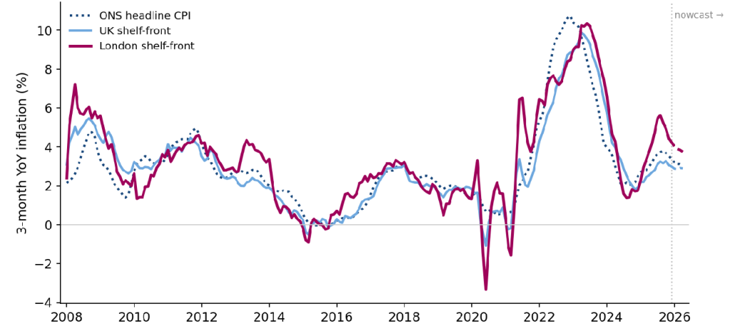
Note: Three-month year-on-year inflation rate. Dashed sections are nowcast estimates; the grey marker shows where observed data end; the CPI line is dotted throughout.
Source: Long-Run Price Database (R. Davies); ONS Consumer Price Inflation. GLA Economics calculations.
Same item, different price tag
So far, we have discussed how fast prices are rising. A different question, and the one people usually mean when they say London is expensive, is how much things cost relative to the rest of the UK.
Because the data record real shelf prices at the product-level, we can directly compare costs for the same item in London and the UK. We focus on 68 standardised items, a subset of the much wider basket chosen because product definitions allow for like-for-like comparison. For each item, how much more (or less) it costs in London than across the UK. Of these 68 products, London prices were higher than UK prices in 81% of cases (55 of the 68). The typical product cost about 12% more in London than in the UK. That is the median London-versus-UK price difference: for half the items the London premium was bigger than this, and for half it was smaller.
The packaged groceries sold by the big national chains barely differ at all: two pints of milk, frozen peas, a chocolate bar and a bag of bananas are at parity or even slightly cheaper in London, because the largest supermarket chains tend to follow broadly national pricing strategies (see Figure A4).
The premium emerges instead in things shaped by local rents and wages. A pint of beer costs over a quarter more in London, fish and chips around a quarter more, a childminder roughly 44% more and a nursery place around a third more. Clothing shows the largest gaps of all, but those should be treated as indicative, because clothing prices swing sharply with sales and seasons, and a “women’s jumper” in London is not necessarily the same garment as one elsewhere.
Figure A4. London price relative to the UK for the same item
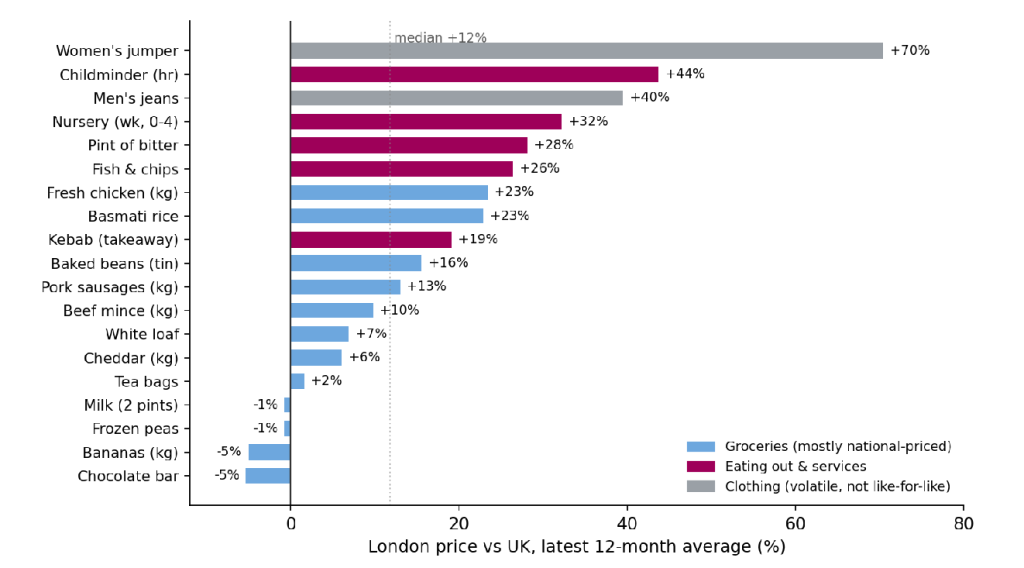
Note: Bars show how much more, or less, a given product costs in London. Latest 12-month average.
Source: Long-Run Price Database (R. Davies); ONS Consumer Price Inflation. GLA Economics calculations.
It is not down to one or two things
To see clearly how the cost of living has evolved in London since the pandemic, we measure cumulative price growth from 2019, the last full year before COVID. On that basis, the London premium is not driven by a single runaway category: London has outpaced the UK across nearly every well-covered part of the shelf-front basket (see Figure A5).
Food prices are up roughly 33% in London against 27% nationally. The running costs of motoring, including fuel, are up around 40% against 34%. Restaurants and eating out have risen roughly 41% against 39%.
The forces behind these category figures are as revealing as the numbers themselves.
Eating out has risen fastest, largely because it is one of the most labour-intensive parts of the basket. Hospitality faced acute staff shortages after the pandemic, the end of free movement tightened labour supply, and successive rises in labour costs. Restaurants also absorbed higher food, energy and rental costs at the same time. In London, where wages and rents are already higher, those pressures fed more directly into menu prices.
Motoring tells a more global story. Its near 40% rise was driven mainly by fuel prices, which tracked the 2022 energy shock, alongside supply-chain disruption in vehicles and parts.
Food sits somewhere in between. Its supply chain is unusually energy-intensive, and the war in Ukraine, higher commodity prices and a weaker pound all pushed food costs sharply higher after 2021. Yet because the largest supermarket chains broadly maintain national pricing, London’s supermarket premium remained relatively modest even as food inflation surged nationally.
A pattern emerges from this. Goods such as food and fuel were driven mainly by global energy and supply-chain shocks that hit the whole country at once. Services, above all eating out, were driven mainly by domestic labour and rent, which are precisely the costs on which London differs most from the rest of the country. The divergence is therefore broad-based, but it is widest where local wages and rents do most of the work. That is why locally provided services are where London steadily pulls away.
Figure A5. Cumulative price growth by category since 2019, London versus the UK
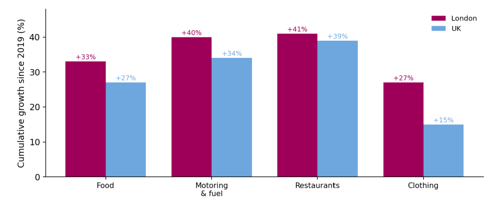
Note: Shelf-front measure; cumulative price growth from Jan 2019 to the latest available month.
Source: Long-Run Price Database (R. Davies); ONS Consumer Price Inflation. GLA Economics calculations.
Figure A6 charts these forces directly. Each driver arrived in its own sequence and left its own legacy. Global supply-chain pressures surged in 2021 before largely fading back to baseline. Energy prices followed with the 2022 gas shock after Russia’s invasion of Ukraine, feeding rapidly into transport, heating and food production costs before easing again as wholesale prices stabilised.
Food prices behaved differently again. Higher fertiliser costs, transport and processing costs pushed food prices sharply higher after 2021, but unlike energy, food prices largely rose in a step that did not reverse.
The most persistent force was wages, particularly in hospitality and other labour-intensive local services. Local shortages, changing migration patterns and stronger competition for workers pushed pay growth higher after the pandemic. Unlike energy or supply-chain shocks, wage pressures did not unwind once global conditions stabilised.
That distinction matters for London because labour-intensive local services make up a larger share of the city’s everyday cost structure. Energy and supply-chain pressures eventually faded. Wage pressures in local services did not.
Figure A6. Key drivers of UK inflation since 2019
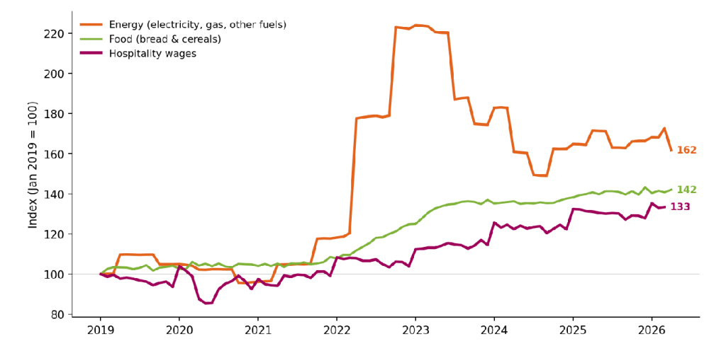
Note: Indices rebased to Jan 2019 = 100. The hospitality wage index is reconstructed from year-on-year growth rates.
Source: ONS Consumer Prices: Electricity, gas & other fuels; ONS CPIH Bread & cereals; ONS AWE Accommodation & food services, regular pay. GLA Economics calculations.
Why London is different
Some of the divergence is structural: Londoners spend their money differently, and the city earns and operates differently too.
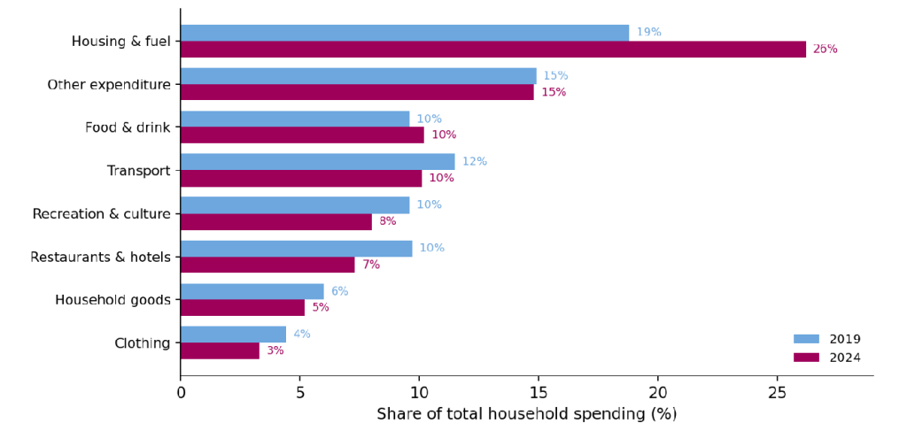
Comparing ONS Family Spending data for 2024 with 2019, housing’s share of the typical London budget has jumped from about 19% to 26% (see Figure A7), squeezing everything around it. Eating out, recreation and clothing have all fallen as a share of the London household budget. Londoners also spend relatively less than the UK on running a car (about 10% of the budget against 14% nationally) and more on housing (26% against 18%). The same national price shock therefore lands differently on a London household, where so much is already committed to keeping a roof overhead.
Figure A7. London household budget shares, 2019 versus 2024
Source: ONS Family Spending Workbook 3; GLA Economics calculations.
Wages matter also. London concentrates more of the country’s high-productivity industries (finance, technology, professional services) and pays them accordingly. Median full-time earnings in the capital sit around a fifth above the national average, with the gap considerably wider in finance and professional services. Those wages spill across the local economy, lifting what a barista, a hairdresser, a nursery worker or a delivery rider must be paid to live in the city. Because productivity in those local services is hard to raise, the higher wage bill flows almost directly into prices. London’s labour market was also unusually exposed to recent shocks. The capital relied more heavily than most of the country on EU workers, particularly in hospitality, warehousing and construction. The end of free movement therefore tightened labour supply more sharply in London than elsewhere. At the same time, successive rises in the National Living Wage applied nationally but interacted with a much higher cost base in the capital. The result was stronger wage pressure in many labour-intensive local services.
Operating costs add another layer. It is not only households that pay London rents; every café, restaurant, gym, nursery and corner shop does too. Commercial rents in central London are multiples of those in many regional towns, and the lease on the premises has to be earned back through what is sold inside. The same is true of business rates, deliveries and many local services. A pint of beer or a portion of fish and chips that costs around a quarter more in London is not the same item made more expensive; it is the same item supplied through a more expensive set of fixed costs.
Rent itself sits outside the shelf-front measure, but it remains central to the London story. Private rents in London surged sharply through 2022–24 as demand rebounded after the pandemic and supply remained constrained[4]. More recently, rental inflation has eased from its 2024 peak but remains well above its long-run average.
Two pints of milk cost much the same across the country. A pint in the pub increasingly does not. Those differences, repeated across the local services Londoners depend on every day, are among the things a single national inflation figure increasingly struggles to capture.
[1] The wage-spillover part of this story is sometimes formalised as the Balassa–Samuelson effect, first proposed by Béla Balassa and Paul Samuelson in 1964 (building on earlier work by Roy Harrod, 1933). The effect describes how, in high-productivity economies, wages rise faster than productivity in non-tradable sectors, pushing up local-services prices. But London’s premium also reflects higher commercial rents, stronger consumer demand and the structure of the labour market, which work alongside and reinforce the wage channel.
[2] This shelf-front measure draws on the Long-Run Price Database assembled by the economist Richard Davies from the in-store price quotes ONS collects for the CPI. It is a trimmed mean of year-on-year price growth across those quotes (about half the basket), re-weighted to London using ONS Family Spending (FYE2024), and excludes centrally-priced items, notably rent and energy. “UK” means the whole United Kingdom, including London, so the London–UK gaps shown here are, if anything, slightly understated.
[3] Nowcast: the latest months, where firm data are not yet collected, are estimated with a simple statistical model (an AR(1) on the gap to CPI) for both London and the UK. Treat them as indicative rather than observed.
[4] Source: ONS, Private rent and house prices, UK: May 2026. Latest available regional private rental inflation data.